Brand Identity for B2B SaaS

Background

Toil is a productivity tool that allows easier collaboration by providing a centralized and secure place to access and share all your files. It was essential for the business to set the right brand voice and personality to ensure it was resonating with its target personas and setting the appropriate tone.

Problem

Build the brand and online experience from the ground up, with special attention to align the brand with targeted personas.

My Role
branding
creative direction

Persona Building

To define the Toil brand, it was imperative to first build and establish the primary user persona so the business has a clear understanding of who they’re building for. 

With an intentionally-defined persona, a real connection can then be made between a product and its users since the traits of the persona should be used to inform the brand personality that users will be most receptive to.

Discovery

With Emma Davis (Customer Success Manager) now in place as Toil’s primary user persona, the next step was to define a brand that would convey the desired impression to Emma.

attribute-scale

Attribute Scale

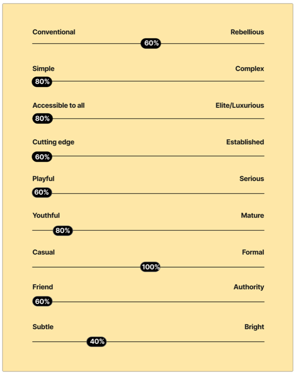
A brand attribute scale helps define brand positioning and acts as a reference tool when it comes to design and messaging.

I gave a group of study participants a blank version of the yellow sheet shown, and asked them to circle where on a scale of 1 to 5 they believed the product Toil should fall along the spectrum in each row to resonate with our persona.

The results shown here tell us which attributes should be expressed in branding elements to best characterize the product.

Personality Traits

What are the traits that match the voice with which we want to communicate with users? Which emotions should Toil express on a regular basis?

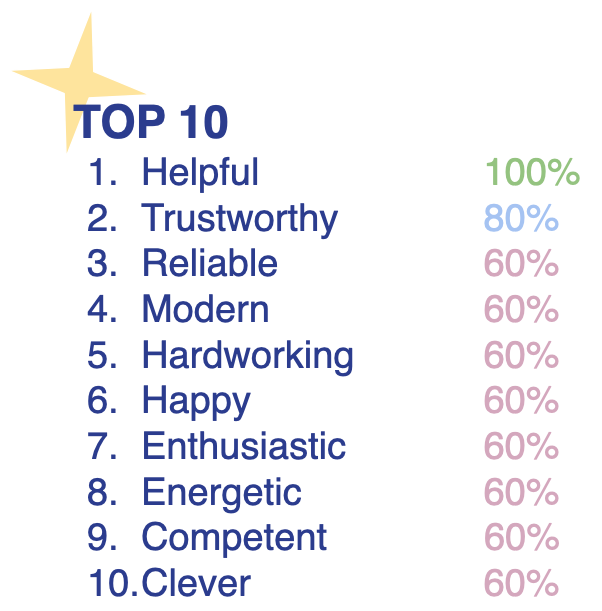
To help pinpoint the brand's personality, I gave participants an extensive list of traits and asked them to circle as many as they felt captured Toil’s essence. The resulting top 10 traits shown here provided a way to define the brand's personality.
Branding

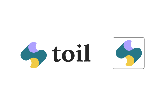
With the brand’s tone and personality now defined, logo explorations began as a starting point to anchor Toil’s visual identity.

The logo is the first thing  users will look for when they see anything from a brand. It should be front and center on all materials as it creates an opportunity to make a product stick in the minds of users.

Explorations

Option A
Option B
Option C
Option C
Option D

Final

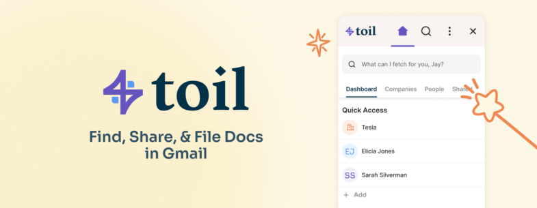
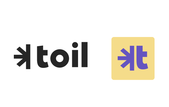
The final logo was selected for a multitude of reasons. The purple icon that serves as the focal point is somewhat open to interpretation – is it a suspension bridge that represents how the product bridges data? A magical starburst to represent how the product has tech that works like magic? Maybe both! 

The symmetrical icon indicates a stable tech product that can be depended upon; paired next to the softer wordmark that is slightly contrasting though complimentary in that it’s friendly and accessible for all.

Website

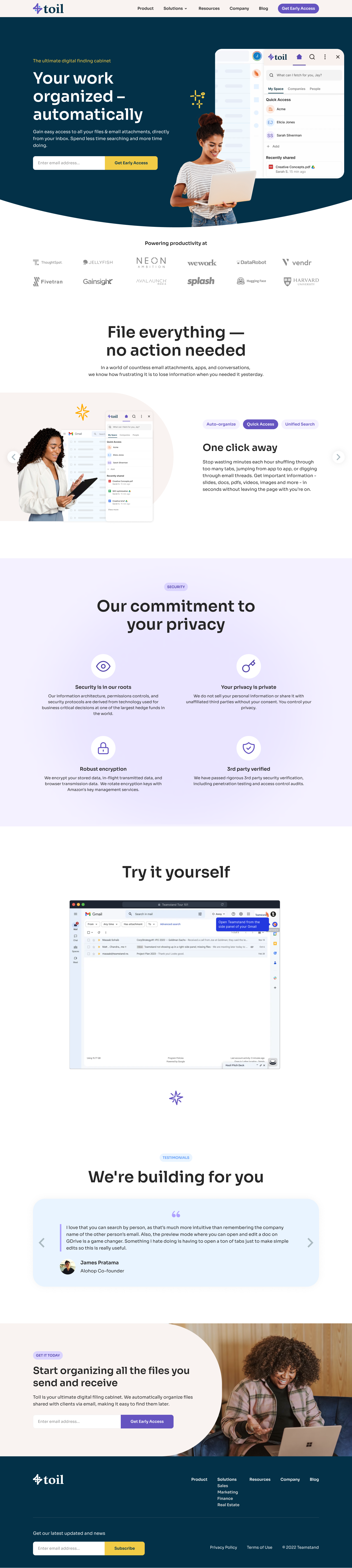
We created a clean and simple visual design for the web experience that incorporated both structured elements to convey cutting-edge data technology, set against curved edge components that are approachable to the persona. 

Toil Homepage

Visual Guidelines

In addition to an extensive design system, I also created visual branding guidelines that combines all aspects of the newly formed company’s identity into a single book that all teams use to reference for brand management – from color palette to logos and imagery – to ensure that branded assets are consistent across channels.